In this blog, we will talk about some of the crucial elements on your Home Page, and a host of best practices associated with them, to help you master conversions like a pro!
1. Search Bar: The search bar in your home page is one of the most ‘handy’ functions for shoppers, so you don’t want to miss out on it.
- Placement: Don’t bury the search bar in your homepage menu. Place and stick it where people can easily locate it, i.e. at the center or at the top right. Make your search option as prominent as possible (within reason).
- Auto-Complete: Your search bar should be able to give auto-complete sentence suggestions along with other related suggestions. Use a drop down list for these to make the design more functional. You can also, ‘Hot/Common Searches’ as an automatic drop down suggestion when the user first clicks on the search bar.
- Text: Don’t keep your search bar blank. Phrases like ‘Search’ or ‘Search for Products, Brands and More’ in the search bar can kick the users to use this functionality and land directly where they want.
2. Transactional Menu: The aim of the transactional menu is to provide an ‘All-At-One-Place’ or ‘Go-To’ Navigation for your product offerings.
- Horizontal vs Vertical: You can either have a Vertical or Horizontal Menu. Some of the most popular eCommerce players, like Amazon, use a combination of both. However, to get you started, Horizontal Menu is highly recommended for D2C brands. This automatically makes the users aware of the principal categories without clicking or looking for it anywhere else. It also makes navigation fairly easier and more comfortable. Vertical Menu, on the other hand, is suggested for marketplaces or for those who have a vast portfolio of products, belonging to numerous categories.
- Hamburger icon: The three horizontal lines that you most commonly see for menus is called the Hamburger Icon. It’s one of the only few icons that have near universal recognition so using it ensures that the customer does not have to scout for it.
- Placement: Place your navigational categories on top with the most prominent categories on the left.
- Images: Your transactional menu can also have images representative of the categories they belong to. Though make sure the images don’t take up a lot of space and are well merged with your overall design.
3. Homepage Banner: Homepage Banner is the most catchy section of your homepage – basically, it’s like a spotlight arena! But some brands get it terribly wrong. Here are some good practices to create effective banners:
- Avoid Auto-Forwarding Carousels: We’ve all tried multiple times to catch hold of those running slides on one or more websites; wasn’t it a frustrating experience? As per a study conducted by the Nielsen Norman group, auto-forwarding carousels annoy users and increase the chances of losing potential customers. So try to avoid automatic-image sliders and keep it static.
- Include Linked Images with CTAs: Every image on the slider should ideally have a different CTA. It should be a concise yet enthusiastic CTA. Although every image should have a landing page, with or without a CTA. So these sliders are able to serve a dual purpose; informing them about the product and also, compelling them to take an action.
- Types of Banners: You can try and test different assets within banners.
– Branding: These banners convey your brand story, philosophy, etc.
– Bestsellers/Popular: This is the most prominent place to promote your best selling category or products.
– New Releases: These are the latest and most exciting items that just landed on your website.
– Offers or Promotions: Currently ongoing offers or promotions can be pushed here. - Navigation Arrows: The image sliders should have clear navigation arrows at the sides and should freeze with any interaction, such as hovering a mouse over it. In case you have automatic carousels, this practice can be very favorable.
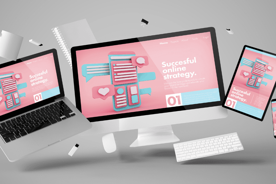
- Handle different devices properly: You’ll want to look at your different display options — mobile, desktop, and tablet. Make sure that your banners are made in such a way that they look good across all devices.
4. Reviews/Testimonials: Homepage is the first page that gets users’ attention and makes them stick along for more. Thus, having testimonials here will build trust among them. Even if they are repeat users, it is always good to foster confidence, and that too, at the start of their journey itself. Testimonials should include
- Pictures or video
- User name
- User city/state/country
Adding this personal information will make the review look even more authentic.
5. Popular Categories: You should showcase your popular categories in the homepage to help users in their exploration process. It can be shown in a tile format, and single or multiple rows can be created. If you have fewer categories, then all categories can also be published in this section.
6. Popular Products: Similar to popular categories, popular products should also be shown on the homepage. This way you can guide users towards the most popular products which are highly likely to be bought by them. Mostly, the users landing on these pages will be repeat users. Therefore, this section can be personalized for them based on their browsing and transaction history.
7. Branding Elements: A good idea is to have more sections on brand messaging, mostly through videos or images, but some brief written content will also be helpful. A homepage is one of the best sources to build as much positive brand perception as you can. Other pages in the user journey are very specific and will be more focused towards the specific user requirements.
8. Homepage Content: Following are some best practices for the overall content on your website’s homepage:
- Keep it Scannable: Your content should be simple yet effective, use short sentences which are less overwhelming. Try to keep your word limit less than 80 characters per line with short paragraphs of maximum 3-4 lines.
- Specifics > Superlatives: Shoppers don’t believe every statement that you put forward. They’re smart, knowledgeable and are no longer influenced by exaggerated claims such as, ‘100% Organic Products’. Although if you display a specific claim or backup your claims with evidence they are much more likely to believe you, such as, ‘100% Organic Products, USDA Certified’. Turn your Persuasion into Conversion!
- Tone Matters: An experiment by Nielsen Norman Group found that different tones of voice on a website have measurable impacts on a users’ perceptions of your brand’s friendliness, trustworthiness, and desirability. Casual, conversational, and enthusiastic tones perform the best. So choose a conversation style that best describes your brand and keep it consistent throughout the home page. ‘How’ you communicate with your users is just as important as ‘what’ you communicate.
9. Hierarchy: Did you know that 4 out of 5 visitors only see the first 3 screenfuls of your homepage? That’s how important the front fold elements are! Place your most important and relevant elements and information like value proposition above the fold. Naturally, the biggest element on your homepage along with the elements on top of your homepage get the highest attention, so design accordingly!
All in all, an eCommerce Homepage has a variety of tasks to perform for its users, from helping people to find and buy products, to setting a tone of what they ought to expect from your brand further, and much more! At the same time, in doing so, it should be able to retain and convert more customers.
The elements above offer a list of the various features and best practices that can be included on your Homepage to kickstart conversions! The sequence of all these sections in the homepage can be tested, and moved up and down, in order to see what works best for your audience. We also recommend using A/B testing across the various individual elements to understand what makes your customers stick for more.