Improving the conversion of your website is a highly rewarding activity. It increases your sales without increasing your spends, thereby helping you grow your bottom line. While there are scores of areas you should focus on to improve the conversion rate of your website, we will discuss the category pages in a three-part newsletter. So stay tuned!
Like a supermarket aisle, category pages ensure that your customers find it easier to browse through the product catalog. A major challenge is to ensure a smooth browsing experience by creating user-friendly and functional category pages that would help retain customers and improve conversion rate.
In the first part of this three-part series, we discuss critical design and UI/UX facets of category pages and best practices to optimize them for better conversions.
Attractive and Simple Layout
Whenever a user lands on a category page, they already have a product in mind, they are just trying to decide which option to buy. The arrangement of texts, images, links, and relevant information determines how soon the user makes a decision. Using the right tone and color contrast helps the user instantly identify the product category. For example, green for healthy products and purple for premium ones. An Adobe survey found that 38% of people stop engaging with a website that has an ‘unattractive’ layout.
The goal of any layout should be to create a smooth, free-flowing browsing experience that promotes higher engagement and click through to product pages.
- Call to Action Buttons: Call to action or CTA buttons signifies your most desired action for a site visitor. Effective and compelling CTAs can significantly boost conversions. Create CTAs which can stand out with contrasting colors, ensure the size and shape of the CTAs are proportional to products and other design elements on your category page. Invoke a sense of urgency by using action words such as ‘buy now’, ‘order now’, ‘reserve’, ‘notify when in stock’.
- Banners: Banners can help promote new launches, discounts, and sales, highlight top products and their features. They can be used to enhance the theme of your category page by using lifestyle images. Keep your banners relevant to your category, add CTA buttons, and make them visually appealing to increase engagement on your category page. Banners will lose their appeal if not changed at regular intervals matching with changing events, products on your category page.
- Subcategories: Subcategories help users discover the right product in the fastest time possible. A good way of creating a subcategory would depend upon the number of variations. For example, if a website sells healthy food products, breakfast foods would be a category. They can be broken down by creating subcategories such as cereals, muesli, cornflakes, ready to make, etc. Analysis of search queries on your website can help you understand the various ways customers land on products and this data can be utilized to develop subcategories that are suited for your target audience.
- Curated Categories: There are various ways to differentiate between categories. You can develop a different layout based upon various sections of your website. For example, if you have an apparel store, you can differentiate categories by gender, type of clothing, seasonal wear, latest in fashion along with curating categories that could combine best selling products or feature products on discount or sale.
- Category Image: Use generic, standard-sized images that your audience will be able to relate a category with, and give your page a feel of uniformity and make browsing hassle-free. Images or icons should focus on the main product and not overwrite the value proposition of the product. For example, the sports equipment category can be represented by an image of a football or a tennis racket.
Easy and Intuitive Navigation
Navigation is ultimately what gives the users a sense of orientation, helps create a smooth flow of movement, and enables exploration of the website. Navigation is of two types, horizontal navigation, and vertical navigation. There is no one size fits all rule here, but what can help determine the right kind of navigation for a website depends on the use case.
- Horizontal Navigation: It makes efficient use of website real estate by showing more products through dropdowns and grids. This is done in order of priority/popularity from left to right. It is known to improve visibility and result in higher clicks and conversions.
- Vertical Navigation: Also known as left-hand navigation, it enables you to place all relevant categories, subcategories on the left section of your category page which encourages users to scan and explore. It is also very useful while displaying products that involve a lot of variables, making it easy to filter and sort through options.
Another feature that is super useful for a user is adding breadcrumbs. These are clickable links at the top or bottom of your page which reveal the exact location within a website and show users the trail/path right from the homepage to the given page.
Seamless User Interaction
Choosing the right type of design for user interaction with products on category pages can make the difference between a good or a bad experience.
- Hover Based Interaction: This can be utilized when users are comparing a large number of products in a grid system, where hovering over a product can enlarge images, showcase variations, call to action buttons such as add to cart, wishlist, ability to see multiple images of the product without the user having to enter the product page.
- Click Based Interaction: This can be used for category pages with a lower number of products which are designed as a list where a single product appears on each row or grid. When users can click on a product, a pop up window opens with information ranging from detailed description, reviews, images and the option to switch between variations.
- Infinite Scrolling, Pagination or “Load More” Buttons: While pagination remains the most popular way to load new products, it severely limits the number of products a customer would discover. On the other hand, infinite scrolling can greatly improve discovery. High load time, especially on mobile devices, can negatively impact usability. A good solution to this is the ‘load more’ option. It is a responsive functionality that aids in product discovery and does not burden the user with having to figure out which page to go to and instead shows them more results seamlessly.
Responsive Pages for Mobile Shopping
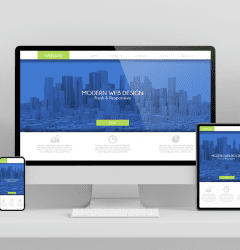
Developing a version of your webpages for various resolutions would not just be impractical, but impossible as well. The best approach is to develop a website where the webpage design and development is responsive to a user’s behavior and environment based on screen size, platform, and orientation.
Responsive web pages are developed by using fluid grids, layouts, images. When combined with intelligent CSS media queries, these can be varied based on the resolution and screen size of the user. Not only does this make your website accessible through all types of devices, but it can also help you curate various aspects of user interface and user interaction based on the type of device.
Category pages are essential to the growth of any e-commerce portal. Having a defined structure and strong design helps in creating a solid foundation, improving conversions and maximizing returns through your website. Every website can create and follow its design philosophy based on the kind of products being sold and changing user behavior.
Stay tuned for more such useful tips in the next part. Want to optimize your category pages for better conversions? Hit reply and let’s chat.


